Thursday, June 4, 2009
Wednesday, June 3, 2009
Monday, June 1, 2009
Xanita 1:1 Mock Up
Building my chair out of Xanita was a big learning curve, I thought while I was designing and while I built the mock up out of thin board than most things I had compensated for, like the thickness of the 10mm Xanita. But of course that didn't turn out to be true and so some major modifications had to be made, mostly to do with joining and supports.
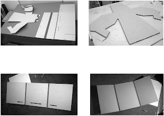
These images show the first stages of the xanita mock up, the first image shows how much the model will use of the complete xanita which was 1830X1220mm. The rest of the images are just the cut outs of the top section and the two base/leg components.
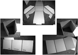
These show the pieces in the previous images with the bend folds and cutouts in place. I used the hairdryer at home to peel the top layer off for the bend folds.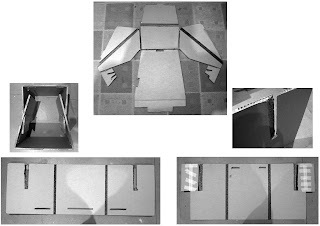
After putting the chair together, I needed to make some modifications to the locking system and so I made cuts on the main body so that the legs could slot into the top. If you look in the top image the new slots have been put in the little square bits at the bottom of the arms. In the bottom right image you can see the parts that I have extended with masking tape, these parts are whats locks into those little square sections so they don't pop out the side when the chair is in use.
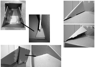
These show some further detailing on the modifications I had to make, the top left photos show the new locking system I described earlier with the little square parts on the arms and the extension on the leg component. The right images show the problems I was having with the arms, originally they were to fold under the seat and lock with the legs but this wasn't going to work, instead I chose to just lock them in the top. I cut out rectangles for the tabs to slot into but they repeatedly popped out, this lead to the modification in the bottom left photos, I was to have the backrest lock into the back, which worked but I chose to flip it to the front and lock it in there, this solved the problem of the arms popping out and kept it quite rigid.
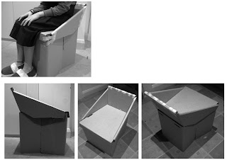
And this is my final Xanita mock up, it still holds true to the original shape even with the problems that needed to be addressed. The seat comfortably holds my weight, so should be able to hold the 150kg and it doesn't take to long to put together, hopefully the final model works out.

These images show the first stages of the xanita mock up, the first image shows how much the model will use of the complete xanita which was 1830X1220mm. The rest of the images are just the cut outs of the top section and the two base/leg components.

These show the pieces in the previous images with the bend folds and cutouts in place. I used the hairdryer at home to peel the top layer off for the bend folds.

After putting the chair together, I needed to make some modifications to the locking system and so I made cuts on the main body so that the legs could slot into the top. If you look in the top image the new slots have been put in the little square bits at the bottom of the arms. In the bottom right image you can see the parts that I have extended with masking tape, these parts are whats locks into those little square sections so they don't pop out the side when the chair is in use.

These show some further detailing on the modifications I had to make, the top left photos show the new locking system I described earlier with the little square parts on the arms and the extension on the leg component. The right images show the problems I was having with the arms, originally they were to fold under the seat and lock with the legs but this wasn't going to work, instead I chose to just lock them in the top. I cut out rectangles for the tabs to slot into but they repeatedly popped out, this lead to the modification in the bottom left photos, I was to have the backrest lock into the back, which worked but I chose to flip it to the front and lock it in there, this solved the problem of the arms popping out and kept it quite rigid.

And this is my final Xanita mock up, it still holds true to the original shape even with the problems that needed to be addressed. The seat comfortably holds my weight, so should be able to hold the 150kg and it doesn't take to long to put together, hopefully the final model works out.
Wednesday, May 20, 2009
Chosen Design 'Modified' 1:1 Mockup
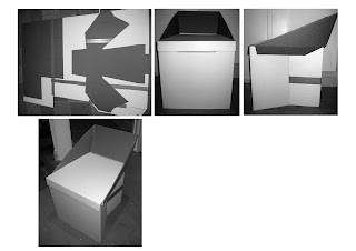
After completing last weeks 1:1 mockup, it was clear that the chair could still do with some modifying. So out came the stanley knife, pieces were cut off and new folds were made. I knew the new direction I wanted to head in so I made another mockup, as you can see above, the general form still holds true to the original idea but I shortened the backrest, folded over the armrests to create a cleaner look and also enhanced the bottom section so that it was structurally more stable.
Tuesday, May 12, 2009
Chosen Design 1:1 Mock-up
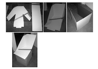
After a few modifications to the overall design, it was time to create a 1:1 mock-up out of cardboard. The above shows a glimpse of the process, the first image shows the cutouts I made from the cardboard sheets that I duck taped together to create a 1830x1220mm sheet. The second image shows the top section of the chair folded up and in its final state. The third image shows the base of the chair and lastly an image showing the top and bottom sections brought together in unison to create the final form.
Wednesday, May 6, 2009
Model Trial 04
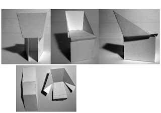
After going over the previous model it was clear that some changes had to be made, so I continued with some quick sketches and came to this design. It consists of two parts, the base/legs and the top/seat area. The arm supports tuck under the seat and once produced in xanita will intersect and lock in with the base after I have cut channels for them to sit in. The front of the chair will also fold over and slot into the front of the legs to give a cleaner look to the front of the chair.
Model Trial 03
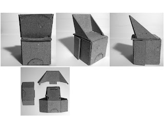
After finishing my last group of sketches to further my development I made this chair model from thick card. On completing the model I discovered some flaws, like how the arm supports cut into the seat, well on the bottom where they protrude this would interfere with the leg supports bending underneath. In the model the supports where supposed to tuck under more but the card always bent outwards.
Tuesday, May 5, 2009
Development Continuation 2
Development Continuation
Tuesday, April 21, 2009
Concept Three
Concept Two
Concept One
Event Research
Model Trial 02
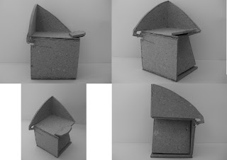
My second model, helped me to understand how the cardboard would fold. When I was sketching this model I made the backrest support longer so that the backrest could lie back a little, but when it came to the model I realised that I would have to also angle the support not just add length to it, so that was a learning curve. Using this board was more about proportion than how things would actually be folded, because the Xanita is thicker than this its hard to create the same folds. Overall I think with a few adjustments this model could work, also the fact that I have used two supports under the seat, it would eliminate the problem I discussed with previous model.
Model Trial
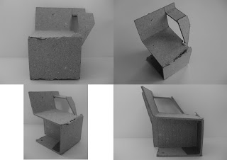
The first model that I built using thick box board. Realising the scale of the model, it probably would've been better to use thin box board. The model was quite easy to build, the only trouble I had was cutting the out the part where the table locks onto the actual chair, on the full scale model this would have been easier as its not so fiddly and hard to cut. Besides that the chair seems to sit well. One modification that I would make if I took this design to the next stage would be to fix the support beam under the chair, because it is only one piece running along the centre of the chair if the user wasn't to sit perfectly in the middle it may tip to one side or the other.
Monday, April 20, 2009
Concept Development 3
Concept Development 2
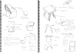
This is the continuation of the chair development. I wanted to add some organic shape to the seat, so I curved the backrest and backrest support on the design on the left. I also added curves to the table attachment. This design is similar to the previous, but instead of having two backrest supports I have enlarged it and made more of a feature out it, possibly creating an armrest.
The right design, based on the proportions of a stool. This concept built a good platform for some ideas that I played around with, such as doubling the xanita board over, so that it allowed the table attachment to slot into the seat rather than join on top. This seat base also allowed the legs to slot into the base of the seat more easily and secure them.
Concept Development
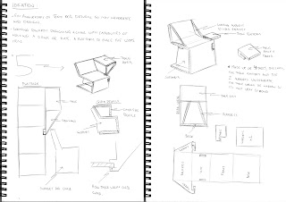
These are the first designs that I developed in my initial stages of conceptualizing. With the left hand design I tried to incorporate the number 5 into the design. The number 5 is significant for the 100% Design Tokyo event because this is its 5th year of running. So from the side profile, it represents the number 5, with the incorporated table.
The second design is similar, but I moved away from the 5 shape, it was more a building of the previous design. I tried to make the 'table' part a little more subtle, slightly more an add on rather than part of the seat. This design is more sturdy than the previous as more support mechanisms are integrated.
Saturday, April 18, 2009
Cardboard Furniture Research
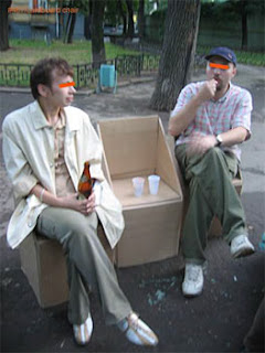
http://www.designboom.com/cardboard3.html
A site that I came across, that has several different folding cardboard solutions for chairs and seating. They show progress from the initial sheet to the final chair, which is very helpful, especially because I have never dealt with cardboard furniture pieces.
Tuesday, April 14, 2009
Themeboard
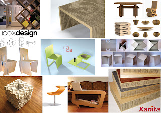
After picking to incorporate a furniture application into the 100% Design Tokyo event I thought it would be sensible to create a theme board to create a 'picture' of the direction I am considering to head in. I will be doing a chair, I haven't decided as such yet whether it will be stool or more a lounge chair, but I do envisage a seat with a built in platform so that visitors may place a drink or food near them when they are seated.
Friday, April 10, 2009
Event Research Cont'd...
Event Research

This is my initial event research that I undertook, the first part of the page is just notes I took in class about the project. The bottom half is my own personal research that I did just to get more of a scope for each event and what they were about. This first page is to do with the Design Made Trade Melbourne and Salone Satellite Milan, the next blog entry is a continuation of this research.
Monday, April 6, 2009
Esquisse Four
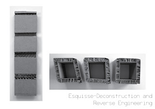
This is the result of my xanita box trials. The image on the left shows the flat pattern of the different folds we trialled. The image to the right shows my development from my first box to my last, as you can see they became slightly better as I got use to the limitations and the dimensions needed to create the 60x60x60mm box.
Tuesday, March 31, 2009
Esquisse Three
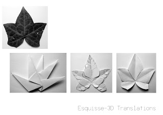
I chose to use a Maple leaf that I found to create in a 3D paper translation. The first paper representation I made was formed through the use of Origami. It was simply made from a square section of A4 paper, folded and overlapped to create the above.
The second representation was slightly more meticulous, I firstly cut out the general shape of the leaf, I then tried to replicate the 'veins' by cutting out shapes in decreasing size to correctly follow the Fibonacci sequence. I then took this pattern and connected them with the general shape I cut out before. I made small cuts for the shapes to slot into.The third representation was done by cutting out the shapes of the main leaf sections then connecting them by using slits and a strip of paper.
Tuesday, March 24, 2009
Esquisse Two
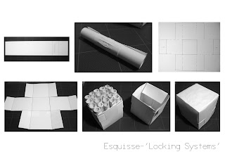
This is the path I headed down for my structural strength esquisse. I started off by cutting a strip of 250gsm card and rolling it up really tightly. To keep it from unravelling I tucked the end of it back into itself. This shape and design proved quite strong so I made about 20 of these. I then needed to house the 'scrolls' so I made a box design as you see above, at first the box split when I tested it so i wrapped a strip around and weaved it in and out. I made two of these boxes and put one on top of the other.
Tuesday, March 17, 2009
Esquisse One-Sphere
Saturday, March 14, 2009
Wednesday, March 11, 2009
Flat Pattern Article
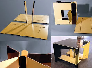
http://weburbanist.com/2008/01/13/more-creative-furniture-for-cramped-urban-living-20-pieces-of-ingenious-flat-pack-urban-furniture/comment-page-2/
Just a site i came across that deals with flat pack furniture design. At the bottom of the page you can also go forwards and backwards to other pages that discuss convertible urban furniture.
Tuesday, March 10, 2009
Subscribe to:
Comments (Atom)


